Usul Rebrand
- role
- Product Designer
- skills
- Brand Strategy
Stakeholder Alignment
Visual Design
Design Systems
Outcome
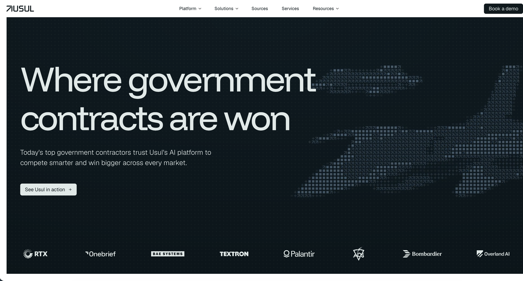
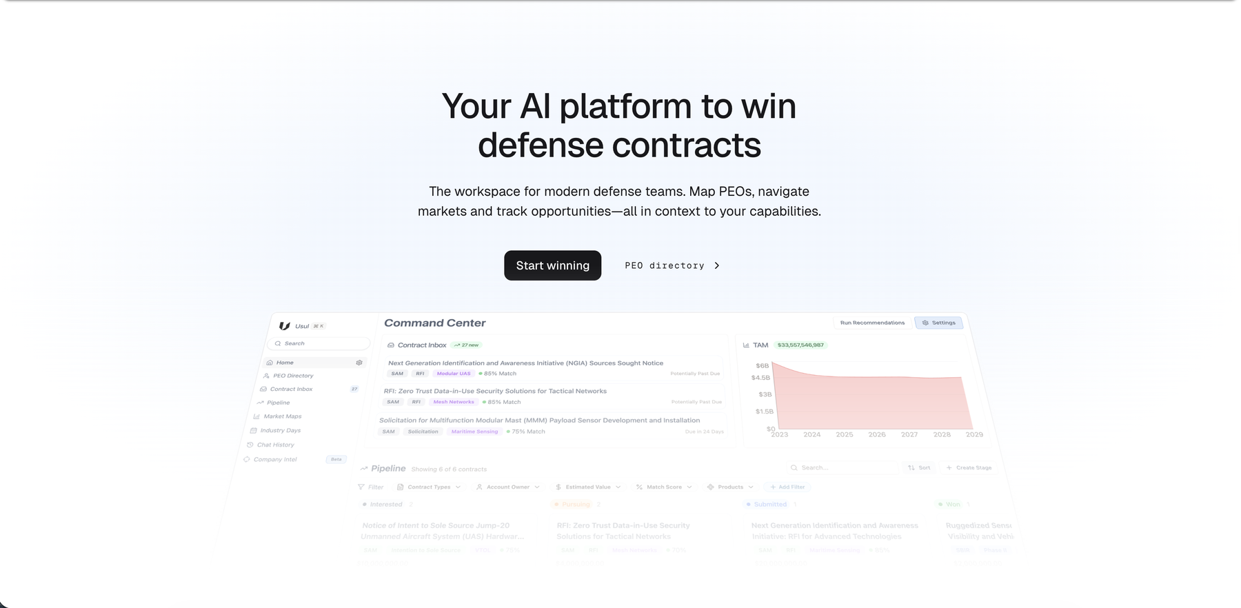
Usul shipped a unified brand and product identity across its website, marketing, and application in a compressed six-week window ahead of its Series A raise, closing the gap between a sharp, cohesive marketing identity and a product the founders themselves described as a "hodgepodge."
I ran the process end to end. I diagnosed why the first rebrand attempt hadn't held across the product, surfaced and forced resolution on real disagreements between the CEO and CPO before any design work started, then converged on and shipped a new direction across the actual application, recolored and rebuilt page by page under deadline pressure. The work fed directly into the next problem it exposed, a design system that could hold what had just shipped, which became Design System MCP.
The Setup
Usul had already gone through one rebrand, a pass a teammate had run in time for a major industry conference that touched the product too, not just the website, ad creative, and pitch deck. It hadn't held. By the time paid advertising ramped up and the Series A raise got real, the founders were already naming the disconnect themselves. The branding was very square and sharp, the product was very rounded, and the gap between them was, in their words, a pretty big disconnect. On top of that, both founders had started to see the red-and-orange palette as aggressive rather than trustworthy.
I pushed to fix this before the raise instead of after. I organized a joint working session with the CEO and CPO, walked in with concrete before-and-after examples of what a cohesive brand looks and feels like across touchpoints, and made the case that going into a raise with three different visual languages, one for the website, one for the product, one for marketing, was a real risk, not a cosmetic one.
Where the Founders Disagreed
That first session got us aligned on the biggest thing. The website was the strongest expression of the brand, and the product was the outlier that needed to catch up. But getting two founders in a room doesn't automatically get them to the same answer, and I didn't want to start designing against alignment that wasn't real. So after that meeting, I sent both founders a written questionnaire on brand direction, had them answer independently, and wrote up an analysis of where their answers actually matched and where they didn't.
The gaps were bigger than either of them realized. The CEO wanted the palette locked and identical across every touchpoint, using peripheral-vision consistency as the bar; the CPO wanted color to flex by industry vertical as Usul expanded beyond defense into healthcare and state and local government. They diverged just as sharply on how AI should show up in the product's voice, one leaning toward positioning Usul as an active AI partner, the other wanting AI treated as table stakes rather than a selling point.
Their descriptions of the intended user experience didn't even share vocabulary. Bold and forward-leaning versus clean and calming. And one founder had picked personality keywords that contradicted each other internally, describing the brand as scrappy new kids on the block in one breath and buttoned-up and professional in the next.
I laid all of this out explicitly, including what each unresolved conflict would cost. A design system built against contradictory inputs would get rejected weeks later, and the launch would ship with marketing and product still speaking different languages. That document became the agenda for the close-out meeting, and it's the reason the six-week timeline was survivable. Design work that starts before the people funding it agree on what they're building gets thrown away.
Converging on a Direction
Once the direction was settled, I moved fast and stayed concrete instead of working from mood boards. The audience split we landed on ran wide. Usul's users range from buttoned-up executives and leadership to capture managers with humanities backgrounds to ex-military business development staff who respond to a rougher, more provocative visual language, and we weighted the brand roughly 70/30 toward the corporate end without losing the edge entirely. I used Cursor to reskin the live application across a handful of real color and type directions rather than presenting comps, so the founders were reacting to the actual product, not an interpretation of it.
That let us throw out bad directions fast. Full-round buttons were out immediately as too consumer-facing, pure black and pure white got replaced with softer charcoal tones, and black buttons as the primary CTA went from a question mark to an 80-percent-confidence direction once we checked it against how brands like Legora were already using it. Eight variations narrowed to two or three, then to one: a green, grey, and beige base with blue and orange accents.
Building It Under Compression
From there it was implementation. I recolored and rebuilt components page by page, forecasts first, then active contract cards, then pipeline and settings, all checked against the roughly 1,400px display the platform's largest customer actually used. Contract cards were the hardest page, the most components packed into the smallest space. I walked the CPO through the redesigned core of the product before building out the rest, and they signed off with only minor changes, confirmation the direction worked before I sank more time into it.
Partway through, the timeline compressed further as leadership pushed to ship sooner, so I split the work into a theme-exploration branch to keep iterating in and a documented, clean feature branch to ship from, which kept the migration reversible under pressure instead of turning into an untracked mess. Componentizing everything into a proper design system got deprioritized to a secondary initiative so the rebrand itself could land on time.
Where It Stands
The rebrand shipped, a full visual modernization across the website, product, and marketing, sharing one direction for the first time.
The bigger lesson wasn't about color or components. It was that the hardest part of this project wasn't picking a palette, it was getting two founders to actually agree on what they were building before I touched a single screen. That diagnostic step turned a six-week deadline from a risk into something survivable. It's also what made the next project possible, turning what shipped into an actual design system.