AR Training
- role
- Product Designer
- skills
- 3D Design
VR/AR Design
Prototyping - with
- Greg Thibeault
David Miller
Outcome
Improved knowledge retention by 80%, gave business development a way to demo the product without an engineer in the room, and left behind a training framework built to extend.
Challenge
VigilantHalo is an advanced RF and sensor-fusion platform for mission-critical air traffic environments, the kind of system where the people who understand it best are the engineers who built it, not the people whose job is to sell it.
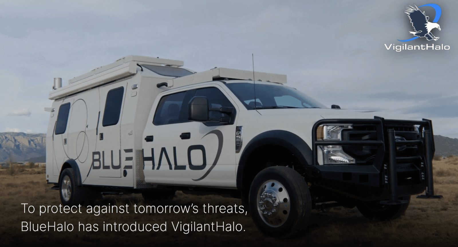
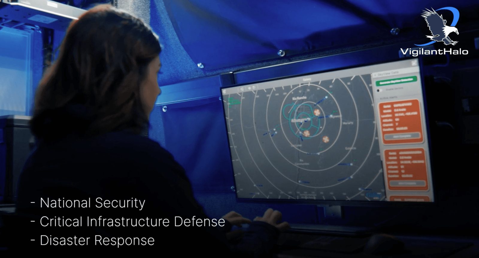
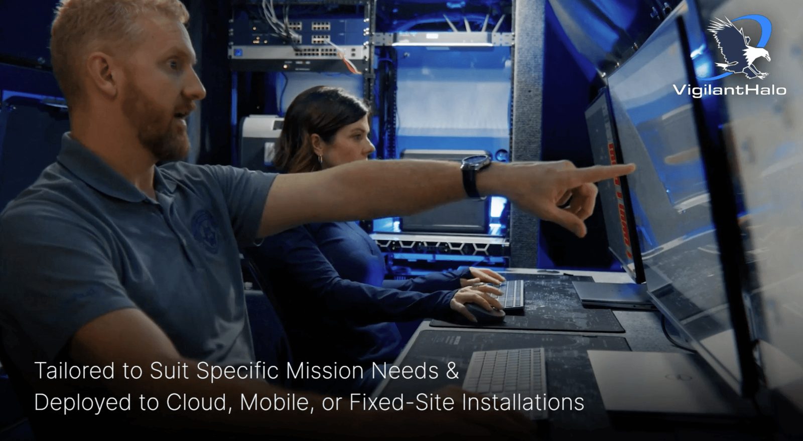
That gap was costing the company real opportunities. Business development had no way to explain the product's capabilities to a prospect without an engineer in the room, and the one visualization tool that existed, a Unity-based prototype, only ran on two iPads and fell apart the moment it left a controlled demo environment. Sales conversations that should have been about value were instead bottlenecked on the availability of the two people who could operate the demo.
User Research
The project began with an unusual constraint. There was no dedicated business development point of contact to design with. I was the only designer on it. Greg Thibeault, my product manager, and the engineers I worked with gave me the input, but the design decisions were mine to make. David Miller, Greg's manager, was leading the effort overall.
So I built my early understanding secondhand, sitting with the engineers who'd attended sales meetings and industry events and pulling out what actually confused prospects versus what they responded to. When a BD specialist joined partway through, I used his input to sharpen the direction rather than restart it, because the pattern had already surfaced clearly. People could learn individual facts about VigilantHalo, but they couldn't see how the pieces fit together as a system. That became the thesis for the whole training experience. Not "explain more," but "make the architecture visible."
Guiding principles
- Clarity over complexity
3D can get overwhelming fast, so visuals needed to be clean and focused.
- Anchored learning points
Users need to connect information to what they're seeing.
- Progressive disclosure
Information needs to be introduced gradually.
Finding the direction
Preliminary idea
After reviewing the prototype and consulting with stakeholders, I refined the outline of the visualization to highlight the truck's hardware and mission-specific scenarios. The early direction leaned toward a gamified experience, something that would boost retention and motivation and that stakeholders could also point to as a selling point during sales conversations.
Narrowing it down
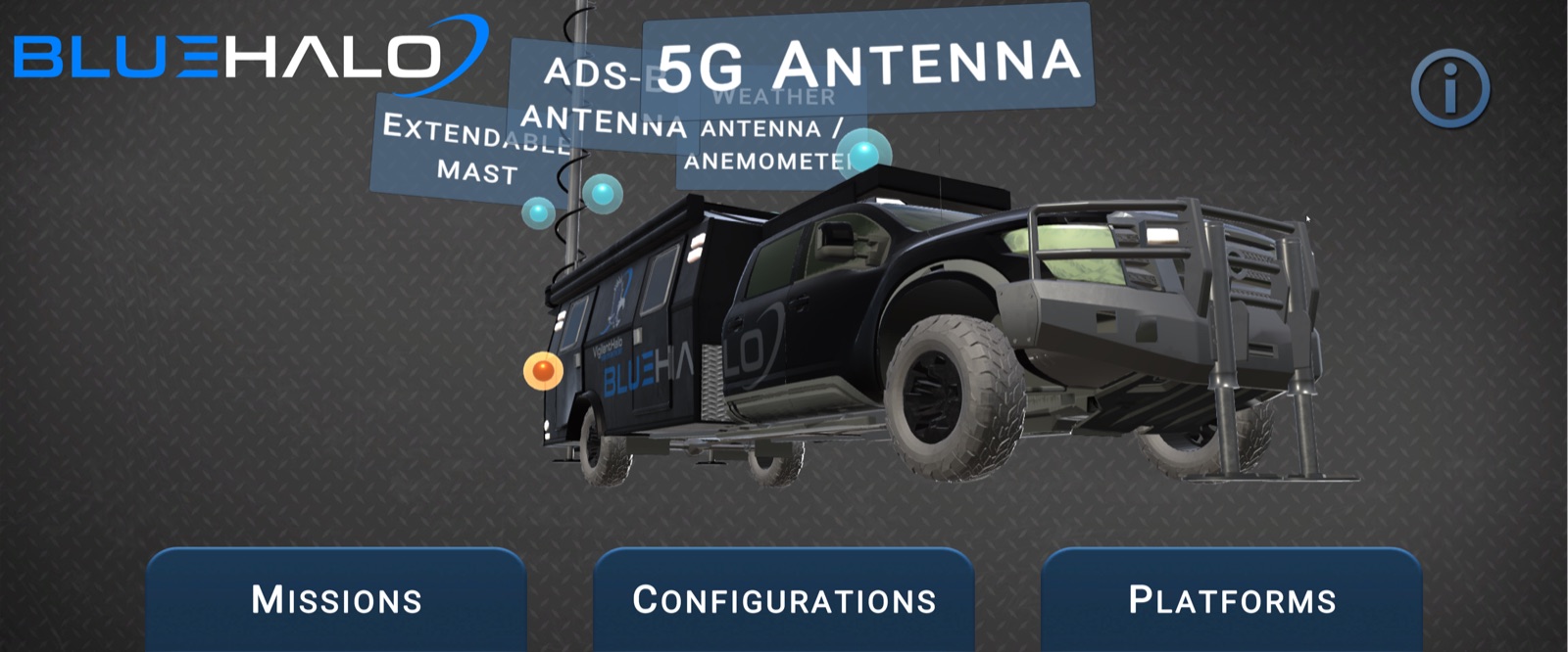
Building that meant working in 3D, which I hadn't done before. Rather than treat that as a blocker, I treated it as a build requirement and went and evaluated platforms directly. I landed on Vectary for its no-code workflow and its ability to deliver a responsive experience across both mobile and desktop, which mattered given how unpredictable the demo environment (trade show floor, customer site, hallway conversation) could be. Picking up 3D wasn't incidental to this project. It was the tool the problem required, so I got fluent enough in it to ship with.
Once I was actually building, a real constraint showed up. With the 3D skill I had and the time on the clock, the fully gamified version wasn't realistic. I cut scope deliberately rather than ship something half built, refocusing on a strong, engaging visualizer built around smart training mechanics instead of a full game layer. That call was mine to make, I didn't need to convince anyone to greenlight it, so the real constraint was my own judgment under time pressure, not stakeholder alignment. That's the part of this project I'd point to first, recognizing early that ambition and feasibility had diverged, and choosing the version that would actually ship well over the version that sounded better in a pitch meeting.
Final solution
The visualizer
With the direction narrowed, I focused on making the experience feel considered rather than merely functional, leaning on Nielsen Norman Group's heuristics around aesthetic and minimalist design and user control. Dynamic camera movement, intuitive interaction patterns, and clear navigation were meant to make exploring the system feel natural instead of like operating a manual. Every element was built to minimize cognitive load while still creating moments that kept a first-time user curious and confident, rather than lost. I checked this direction against informal feedback from BD reps as I built, rather than waiting for a final review to find out what wasn't landing.
Execution wasn't clean the whole way through. A chunk of the 3D assets were lost to Unity file corruption partway through the build, still visible today as a texture and material mismatch in one scene. A full rebuild wasn't worth the time, so I rebuilt the smaller elements directly in Womp3D and brought them into the existing scenes, which kept the project moving without a full restart.
The parallel path
I also designed a parallel path for the people the 3D and AR experience wouldn't serve well, a training deck that broke the same system down linearly, for anyone who preferred a traditional format or was sensitive to motion. That wasn't a checkbox accessibility pass. It became a flexible asset the team reused on later initiatives.
The final training is mobile- and desktop-friendly, mixing 3D and AR capabilities. The AR mode uses markerless placement, so a BD rep can drop a full 3D model of VigilantHalo into any physical space, a hotel conference room, a customer's office, a trade show floor, without needing the real hardware present. That directly solved the original constraint. The old Unity prototype only worked in a controlled setup on two specific iPads. This didn't.
Lessons Learned
The redesigned training system led to an 80% increase in correct answers on post-training knowledge assessments, measured before and after the program. Business development teams reported more confidence presenting the product independently, and faster onboarding for new hires. The original problem, sales blocked on engineer availability, went away. The modular structure meant the team wasn't starting over for the next training need. It was built to extend.
The hardest part of this project wasn't the 3D. It was making the call, mid-project, to trade a more impressive-sounding gamified concept for a scoped-down version I could actually execute well with the skill and time I had. That decision, more than any individual screen, is what let this ship as something people actually adopted instead of something that looked good in a single demo and then stalled.