
ROLE
Product Designer
COLLABORATORS
Sam Stolzoff
Ross Pearlman
Sarah Cordell
Devin Toth
SKILLS
Interaction Design
Prototyping
Accessibility
UX Strategy
THE OUTCOME
Improved clarity, reduced friction, and enhanced usability for both military analysts and non-technical users, setting the stage for future adoption and increased sales opportunities.
THE SUMMARY
What is HaloCortex?
HaloCortex is an AI-driven OSINT (Open Source Intelligence) platform used by military and security teams to analyze public data. Despite having a technically robust backend, the product suffered from fragmented UX, high cognitive load, and unclear interaction flows.
I was brought in as the lead product designer to improve usability, brand alignment, and platform clarity all under tight turnaround, engineering, and budget constraints.


THE PAIN POINT
It's a ball, it's a plane—no, it's... a flaming hedgehog
Research & Evaluation
I needed to understand the two major audiences: how operators integrate data analytic platforms into their workflow, and how business development teams would use the platform for situational awareness I conducted various user interviews with security analysts, business development members, and proxy users to understand their perspectives on the challenges that occur in common workflows as well as how to balance cognitive overload with the presented data.
Competitive analysis of platforms like Scale AI’s Defense LLaMA and Palo Alto’s Cortex Xpanse further emphasized the need for clarity, hierarchy, and guided interactions in AI-driven environments.
A heuristic evaluation revealed a lack of interaction feedback, unclear flows, and visual clutter. The LLM tool—meant to be a key feature—was hidden in the UI and lacked any onboarding, making it difficult for users to trust or even notice. I created an Impact vs. Effort matrix to maximize the time given on the project.

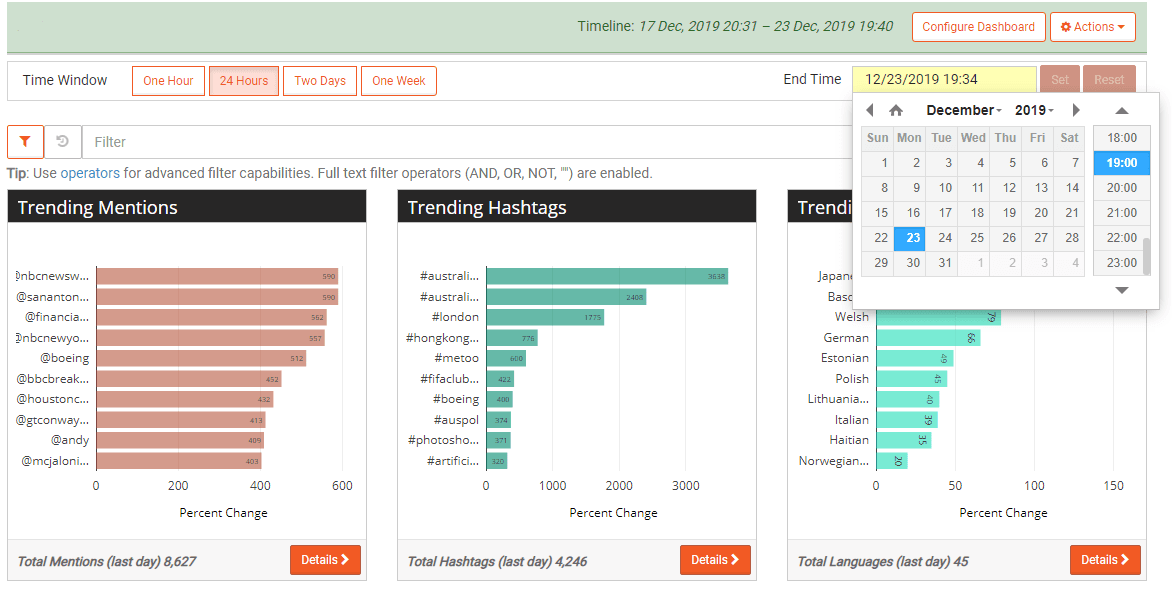
Simplified headers to lower cognitive load & clean up UX hierarchy
Observing the drone pilots made it clear they didn’t understand the intended flow or which search tool to use. While the software met technical requirements and was built for power users, the UX lacked clear visual hierarchy and guidance for non-technical users. I also utilized Attention Insight to see where user focus was going when users landed on the page. Not surprisingly, attention and focus were lost through the page and it had a low amount of clarity.

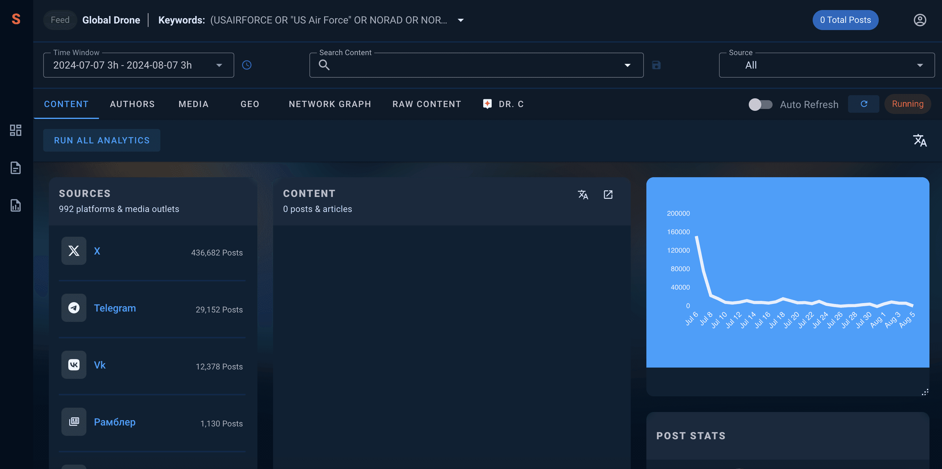
To reduce confusion and improve scanability, I proposed merging the two search experiences into one flexible component. This kept analyst-level control on the backend while providing a simpler entry point for general users. I also restructured the header layout to improve hierarchy and visibility, moving the LLM assistant into a more prominent position.
SOLUTION – #2
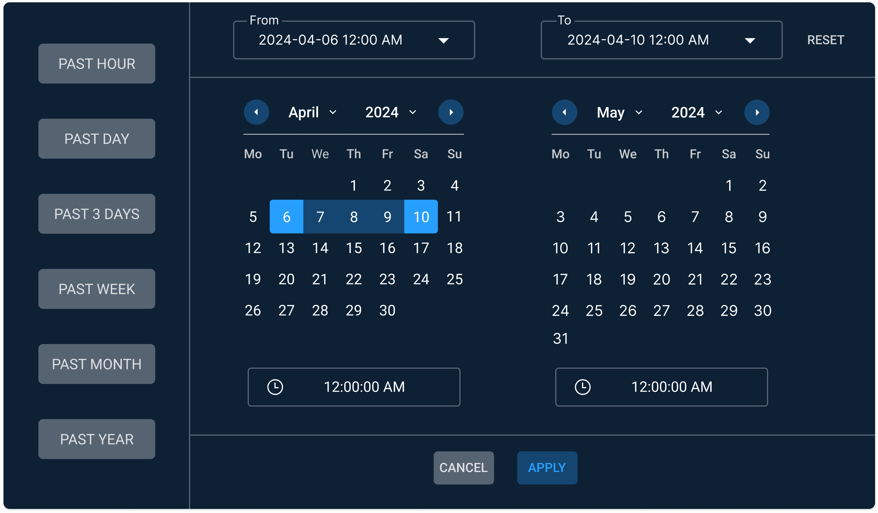
Reducing cognitive load & unnecessary friction within the Time Window
The “Time Window” feature was designed to help users refine searches by specific dates and time ranges. However, the interface overwhelmed users with too many options, presented in a non-intuitive format. Military time overlapped visually, selected values weren’t clearly distinguished, and the UI didn’t offer dynamic feedback, leaving users unsure whether their selections were successfully registered. The overall experience created cognitive overload and introduced unnecessary friction during what should have been a straightforward filtering task.
When testing the window with analysts, I observed confusion–hesitation, frequently resetting filters, etc. Because there was a lack of an immediate visual response to inputs, it made the interaction feel unreliable.The issue was two pronged– a lack of clear interaction feedback and clutter.
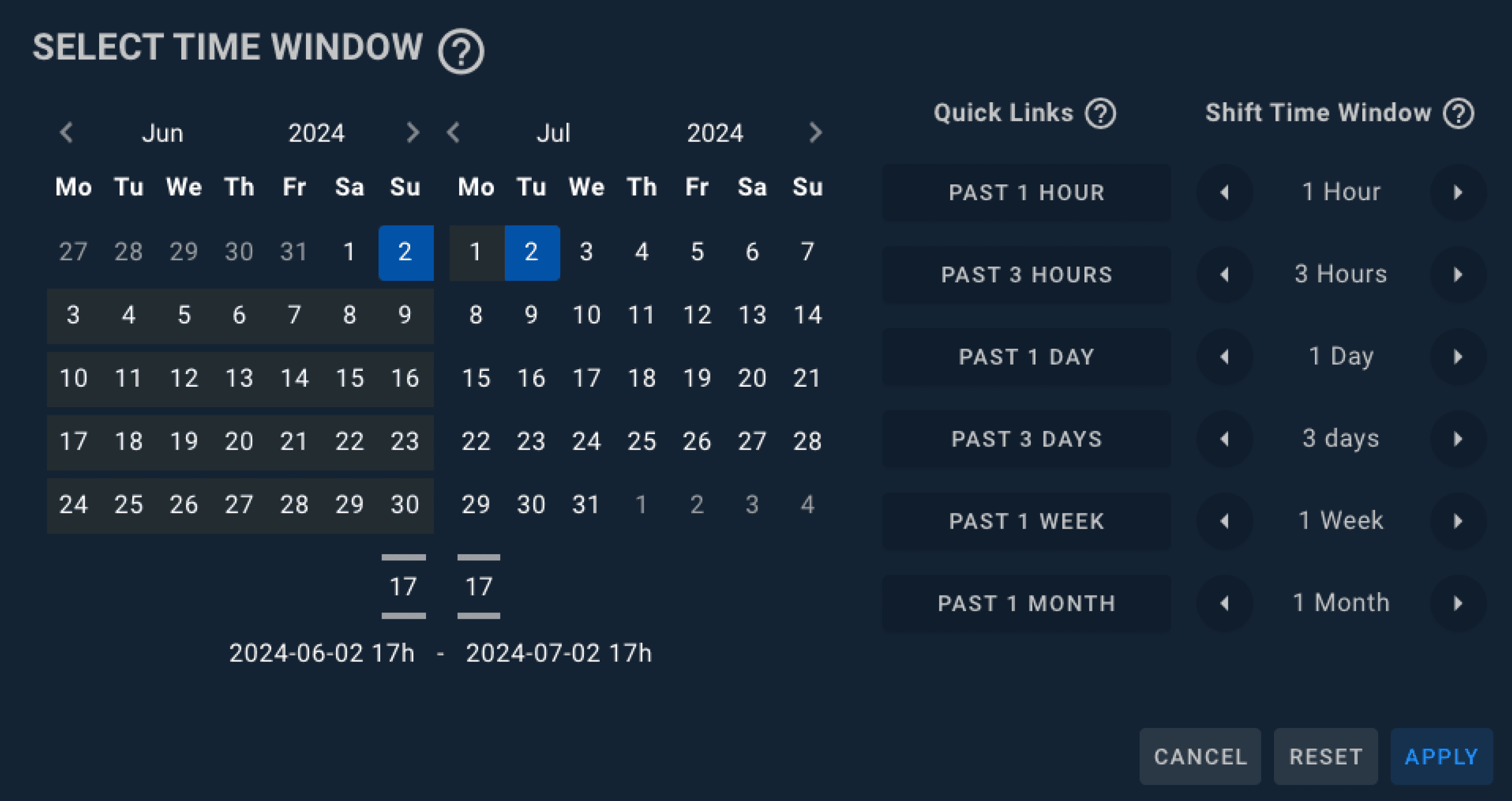

I focused on simplifying the Time Window component by reducing redundancy, addressing unresponsive interactions, and improving clarity. I consolidated the military and AM/PM formats into a single military time option, aligning with our primary user base of military and military-adjacent personnel. I also reduced the number of presented options and repositioned them to the left side of the panel to make them more immediately visible during the scanning process. Finally, I introduced dynamic feedback to reassure users that their selections had been successfully applied.
SOLUTION – #3
Fixing the network graph for increased usability
Working with the intern, I led the redesign of the network graph component to include hover-based previews, contextual info, and faster access to node-related content. Although these changes were not fully implemented due to bandwidth constraints, the redesign served as a future roadmap artifact.
IMPLEMENTATION DIFFERENCES
Collaborating with developers resulted in an aligned and cohesive design
The redesigned Time Window filter was successfully implemented with direct input from my specs and QA reviews. The header structure and search experience were partially adopted – some of the layout and clarity improvements were applied, but the team deprioritized adding user education around the LLM.
Hover interactions in the network graph were dropped due to time constraints, though the structural improvements to filtering logic were maintained.


THE HANDOFF
UX recommendations -> Github-friendly tickets
When presenting my recommendations to the HaloCortex team, the response was overwhelmingly positive, affirming the need for these changes. I prepared handoff documentation to support the redesigns, ensuring a smooth transition for the development team.
To further support the project, I collaborated with the graphic designer to create a typeface guide, update icons, and provide general recommendations on color associations. I also engaged in QA/QC processes to validate their updated designs and ensure they aligned with company branding.
